

There’s not more denying it – the ’90s are back.

Me circa 1993. Not pictured: pegged jeans.
Take a look at the cool kids in your town, and you’ll see it: chokers, flannel, babydoll dresses and mom jeans. Seriously, why are mom jeans back? Hard pass on that one. I’m not anxious to relive ’90s styles, as quick look back at pictures from my tween/teen years shows my ’90s fashion choices weren’t my proudest moments.
Anyway, this blast from the past got me thinking… what if the ’90s styles returned to the web? What would that look like? Well, thanks to the glorious Wayback Machine from the nonprofit Internet Archive service, we can all reflect on the web design trends of the 1990s.
No-Nonsense Interfaces
Jelly shoes weren’t exactly made for performance, but websites in the ’90s preferred function over form.
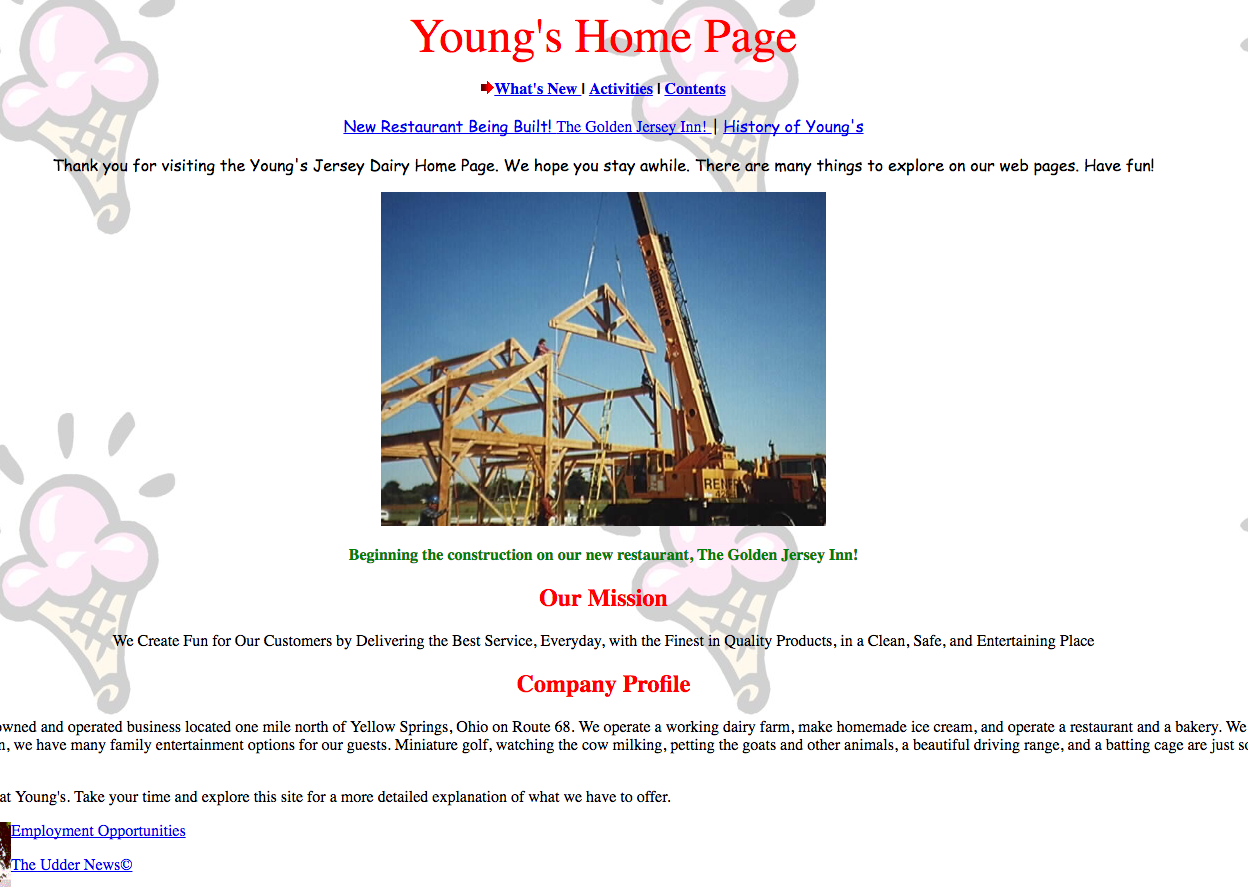 Tables were the building blocks of websites, and it showed through linear designs that were often crowded or boring. Table-based designs limited creativity, so what we got was basic information presented in a less-than-exciting way.
From top technology companies to Fortune 500 firms and small businesses, no-nonsense interfaces were the norm back in the day. This includes the first site our own John Young created for Young’s Dairy in 1997. We can definitely say he was “on trend” with his design!
Prehistoric GIFs
GIFs were around in the ’90s, but weren’t the new-fangled ones kids are sharing today.
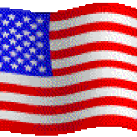 These predecessors to the modern day looping-video GIF were of a simpler variety. You couldn’t visit a website without seeing the ubiquitous American flag GIF, or feel the disappointment associated with an “under construction” GIF.
When I created my first website in school, I distinctly remember using majestic butterfly GIFs to express my style.
Busy Wallpaper
 Maybe it was because website backgrounds were one of the few areas in web design we could express ourselves that we went hog wild with wallpaper. I’m pretty sure I loved Zubaz pants for the same reason.
And some took the wallpaper thing too far (I’m looking at you, Space Jam).
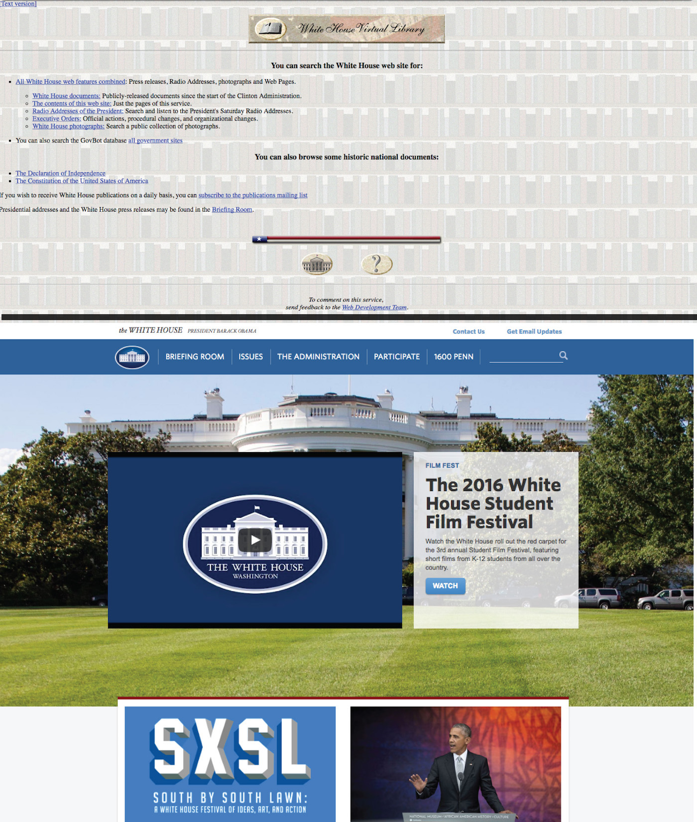
Take The White House’s website circa 1998 for example. It was originally a library archive, as opposed to today’s much more robust, visual resource on everything related to the Obama Administration.
The old school web designers used a library book wallpaper and a couple simple graphics to jazz things up on the 1990s site. Toggle back and forth between the “text” and “graphics” version of the site and not much changes.
Compared with today’s clean, visually-engaging design, The White House’s website has come a long way!
It’s easy to point and laugh now that many of today’s websites have evolved into beautiful, user-focused interfaces. But the developers of 2035 will likely disagree and shake their fists at today’s parallaxes and sticky navigation! I’m afraid the same will happen in reference to the the “athleisure” outfit I’m wearing as I type this.
In a nutshell, I would say my ’90s style and website ’90s style were quite similar: we didn’t look great, but we worked with what we had!
Think you were immune to these trends? Take a trip to the ’90s in the Wayback Machine and reflect on your web design choices!


